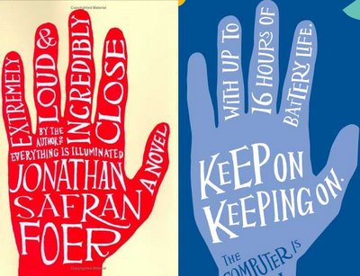
HP's Latest Ad "Borrowed" from JSF?
5 Comments Published by C.J. on Saturday, July 22, 2006 at 11:35 PM.It seems that Hewlett Packard latest print ad looks strikingly similar to the jacket of JSF's 2nd novel, Extremely Loud and Incredibly Close. You be the judge...
UPDATE: Some have suggested that the same design firm was at work here. That is *not* the case. ELAIC was designed by Jon Gray (aka - gray318) [here], HP design was done inhouse, most likely...

How fucking pathetic. Anyone who blatently rips off concepts like that deserves a severe ass kicking! That is some lo down spineless stuff ripping off stuff like that.
Actually, the HP ad was done by Goodby, Silverstein & Partners. I've heard they hired Jon Gray for this because they liked his lettering on the book cover and wanted something similar, but that may be just talk.
interesting, lester, if that is the case.
can you confirm?
they bought the font. not the hand.
http://www.mad.co.uk/Main/Regions/TheSouth/Articles/5844813aada44f81987e2c7b479fee45/Loose-lettering.html
Jon gray was spotted for his work on the book cover and hewlett packard commissioned him to design a font. thus the two look very similar.